Mukherjee Lab
Brain Tumor Outcomes, Palliative Care, and Computational Segmentation
NCDB analysis and segmentation work told through the project figures, tables, and source files.
My RoleResearch assistant focused on data analysis and reproducible workflows
Location / DatesMukherjee Lab, Johns Hopkins University
2024 – Present
2024 – Present
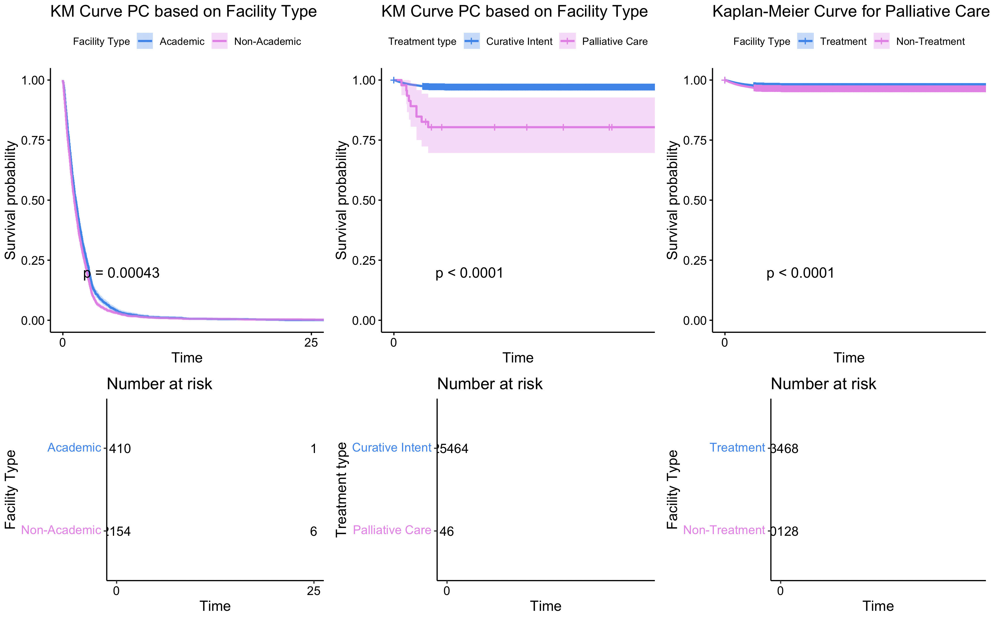
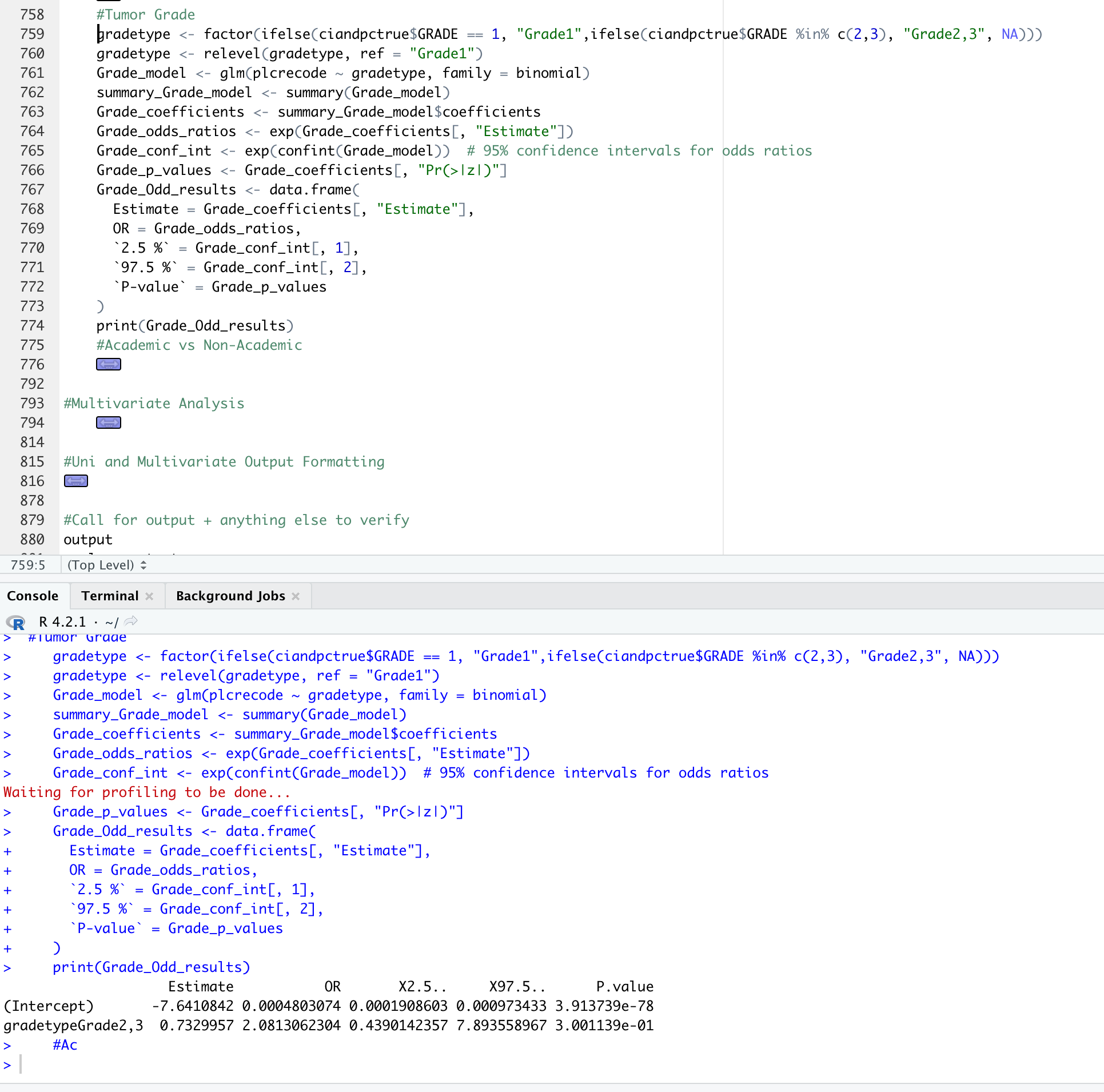
OutputsTables, PRISMA diagram, KM curves, tumor-grade figures, model scripts
Skills LearnedR, survival analysis, survminer, readxl, Python, PyTorch, reproducible workflows
Evidence Trail
Who entered the study?

How was disease grouped?
What changed over time?
Table Signals
Care groups looked different
| Characteristic | Curative | Pain Management | P |
|---|---|---|---|
| Sample Size | 64,057 | 380 | |
| Mean Age | 65 +/- 11 | 71 +/- 12 | <0.001 |
| Female | 43.0% | 47.4% | 0.101 |
| Survival Months | 9.36 | 1.84 | <0.001 |
Predictors pointed to access and acuity
| Variable | Adjusted OR | P |
|---|---|---|
| Increasing Age | 1.04 [1.02-1.05] | <0.001 |
| Highest Income Quartile | 0.66 [0.44-0.99] | 0.045 |
| Charlson-Deyo 2 | 1.83 [1.33-2.47] | <0.001 |
| Right Laterality | 0.55 [0.43-0.71] | <0.001 |
Survival models added context
| Variable | Hazard Ratio | P |
|---|---|---|
| Age | 1.03 [1.03-1.04] | <0.001 |
| Male vs Female | 1.06 [1.04-1.07] | <0.001 |
| Highest Income Quartile | 0.81 [0.78-0.83] | <0.001 |
| Hispanic Ethnicity | 0.78 [0.75-0.81] | <0.001 |
Resource Library
Project READMERepository overview
Meningioma ScriptBaseline tables and modeling
Facility ComparisonsAcademic vs non-academic analysis
NCDB WorkbookStructured source data
Results TableExtracted characteristics and models
Data DictionaryNCDB variable definitions
Analysis ChartCompiled table PDF
Acoustic ScriptStatistical reference script